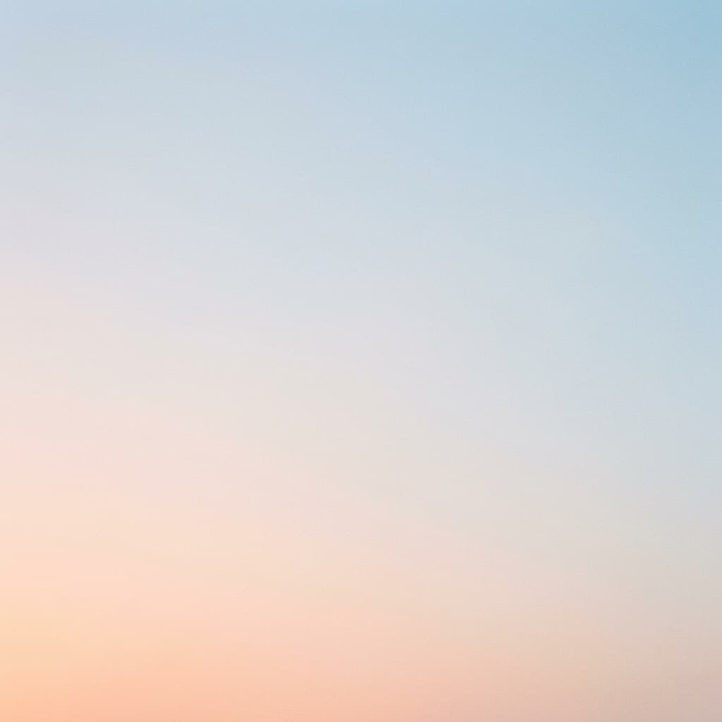
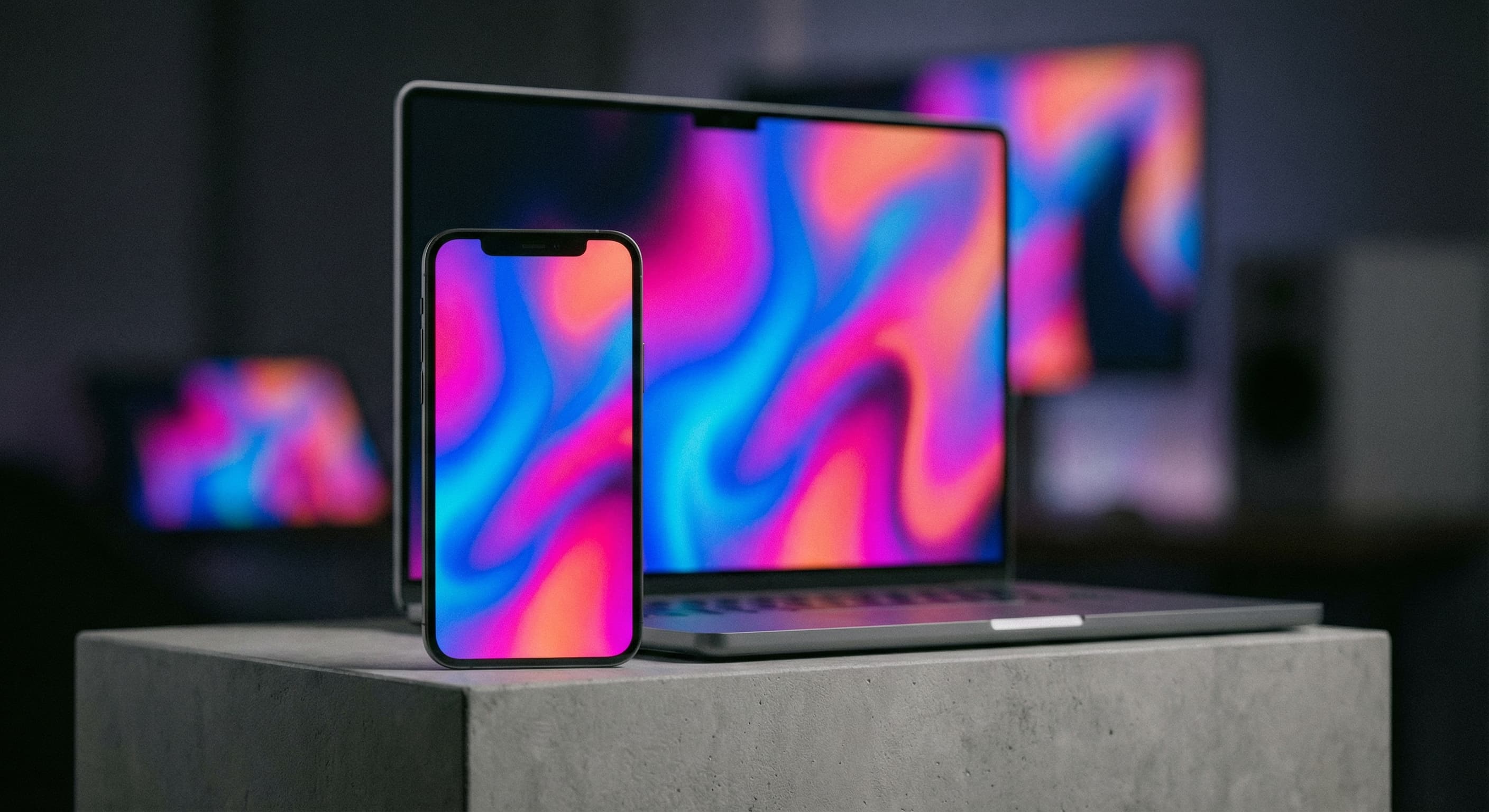
Minimal gradient
“A minimal sunrise gradient background with clean space in the center for a quote.”
Describe the feeling behind the quote and Made generates the visual: an atmospheric, text-ready background composed with clean space for your words — the fastest route to a share-worthy quote post.
Minimal gradient“A minimal sunrise gradient background with clean space in the center for a quote.”
Match the visual to the quote’s feeling — calm, bold, literary, celebratory.
Ask for clean space in the center (or wherever your layout puts the words).
Iterate on palette and density until the visual supports rather than competes.
Add the quote as real text in a design tool — exact wording, clean font, full control.
Real results from Made. Use a prompt to load it into the studio above, then add your own photo.
“A minimal sunrise gradient background with clean space in the center for a quote.”
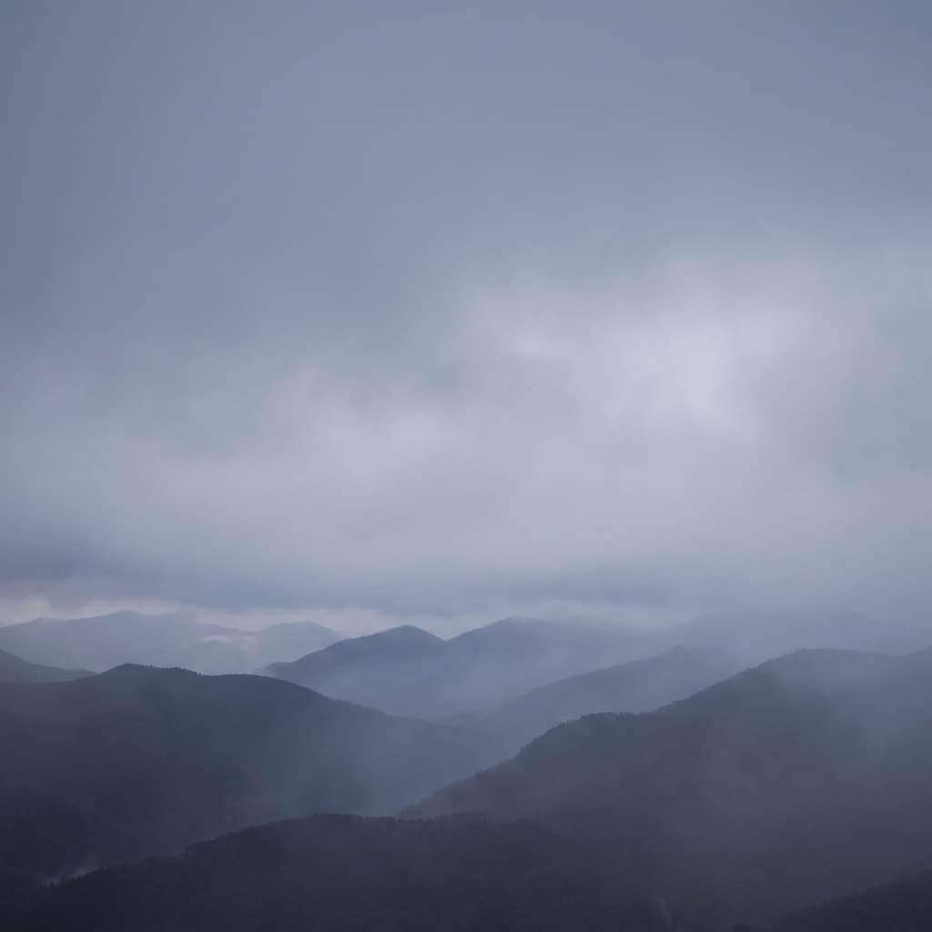
“A misty mountain landscape at dawn, muted tones, calm and reflective, space for text.”
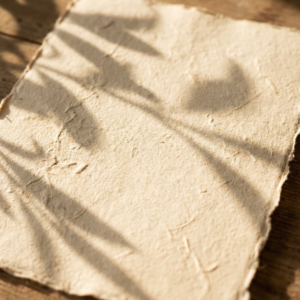
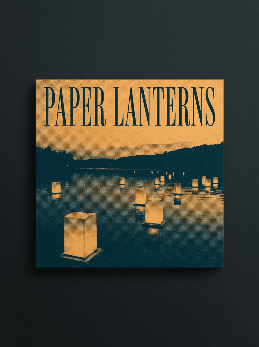
“A warm textured paper background with soft shadows, editorial and literary.”

“A bold color-blocked background in coral and cream, energetic, clean center space.”
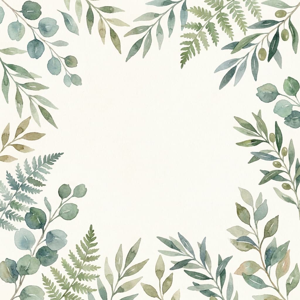
“Soft watercolor botanicals framing the edges, empty center for a wellness quote.”
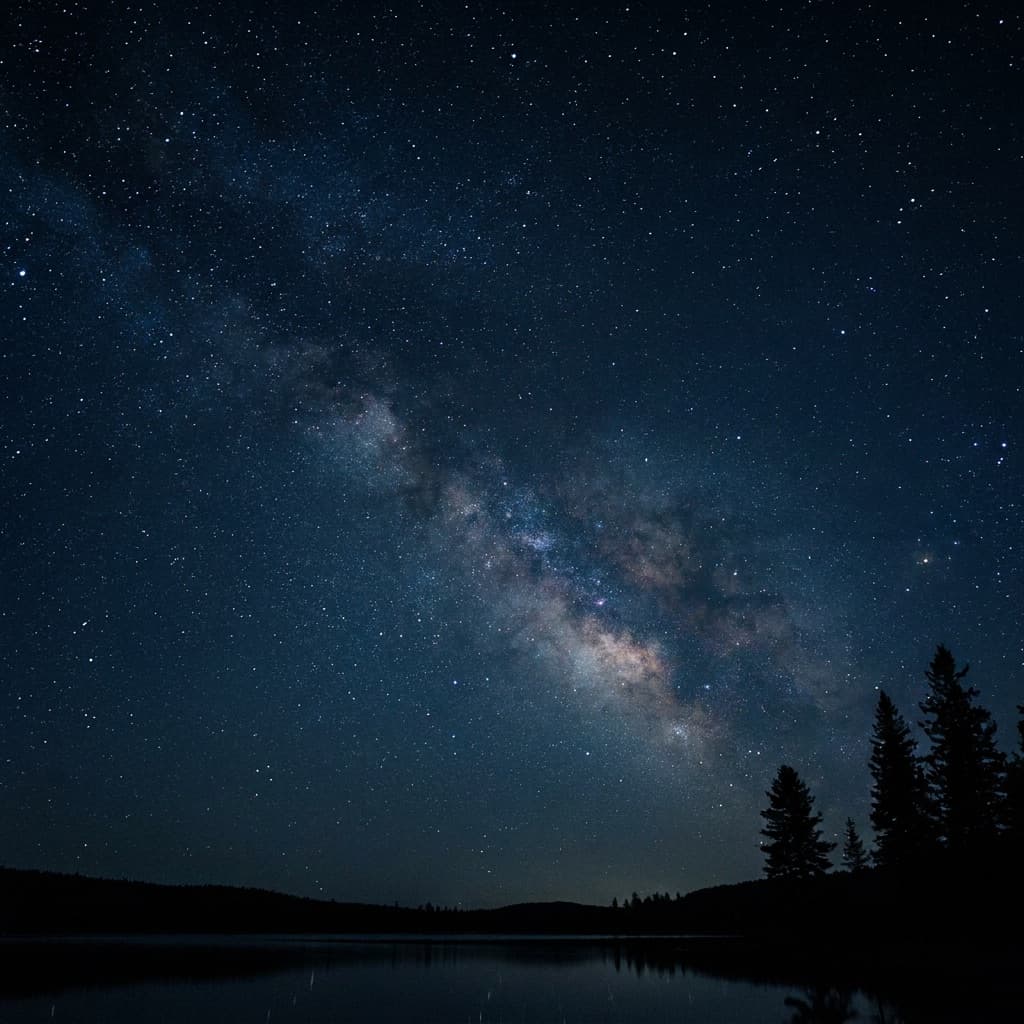
“A deep starry night sky with subtle glow, inspirational mood, dark and clean.”
Checked against the running tool on 2026-09-04.
The reliable workflow is no — generate the background with reserved space, then set the quote as real text in a design tool or your platform’s editor. Generated lettering can misspell, and real text stays editable, searchable, and accessible.
Templates get recognized — audiences scroll past layouts they have seen on other accounts. Generated backgrounds are unique to your description, so a series can feel authored rather than assembled, while you still control typography.
Write one style sentence — palette, texture, mood — and reuse it in every generation, changing only the scene. The posts will read as a family. Save the sentence; it is effectively your series’ design system.
Square suits most feeds; portrait 4:5 earns more screen space; 9:16 works for stories. Ask for the shape when generating, and use Image Resizer if a platform needs exact pixels.
Low-contrast areas where the words will sit, one visual idea, and restrained detail. Gradients, textures, negative-space landscapes, and border-style compositions all hold type well; busy centers fight it.
Yes — name them plainly in the description (“dusty rose and charcoal”) or describe the palette’s feel. Consistent color naming across generations is the single biggest lever for an on-brand feed.
Your own words and public-domain quotes are safe. Short attributed quotes are widely shared, but quotes are not automatically free to use commercially — long excerpts and song lyrics in particular can be enforced. Attribute correctly and check rights for commercial campaigns.

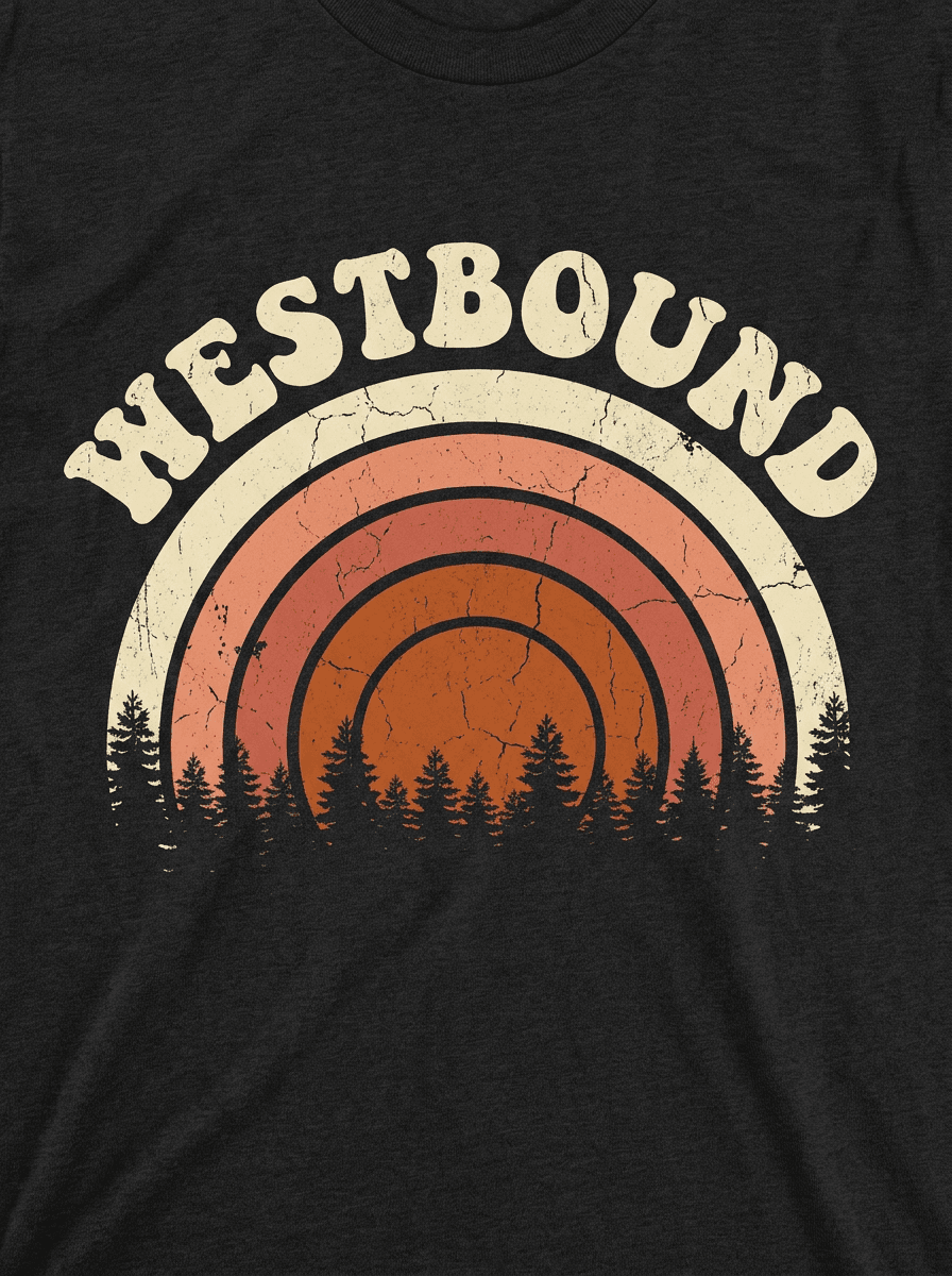
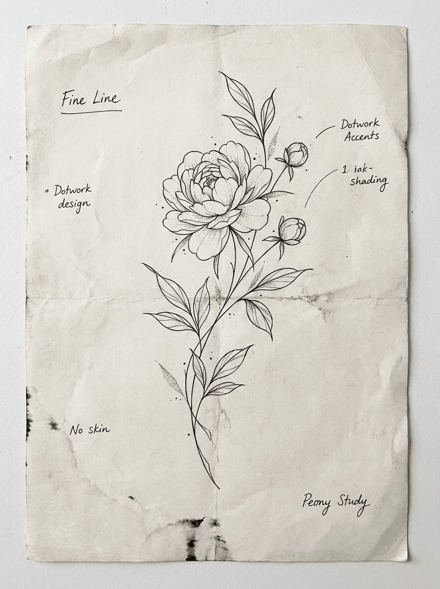
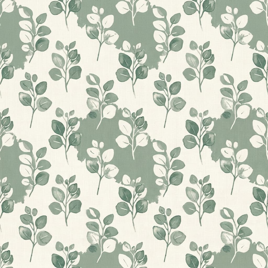
See what each one makes, then open it in Made.