Club night
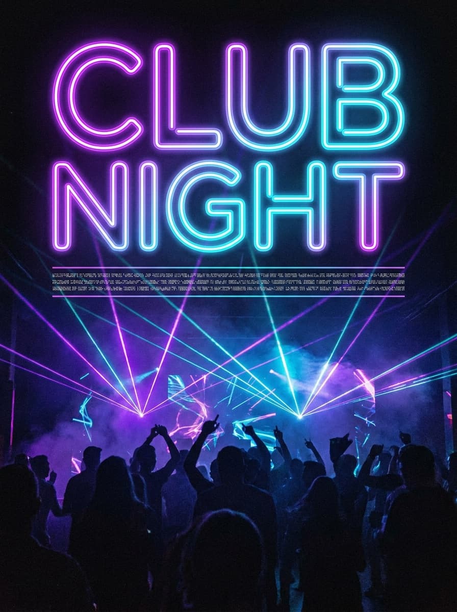
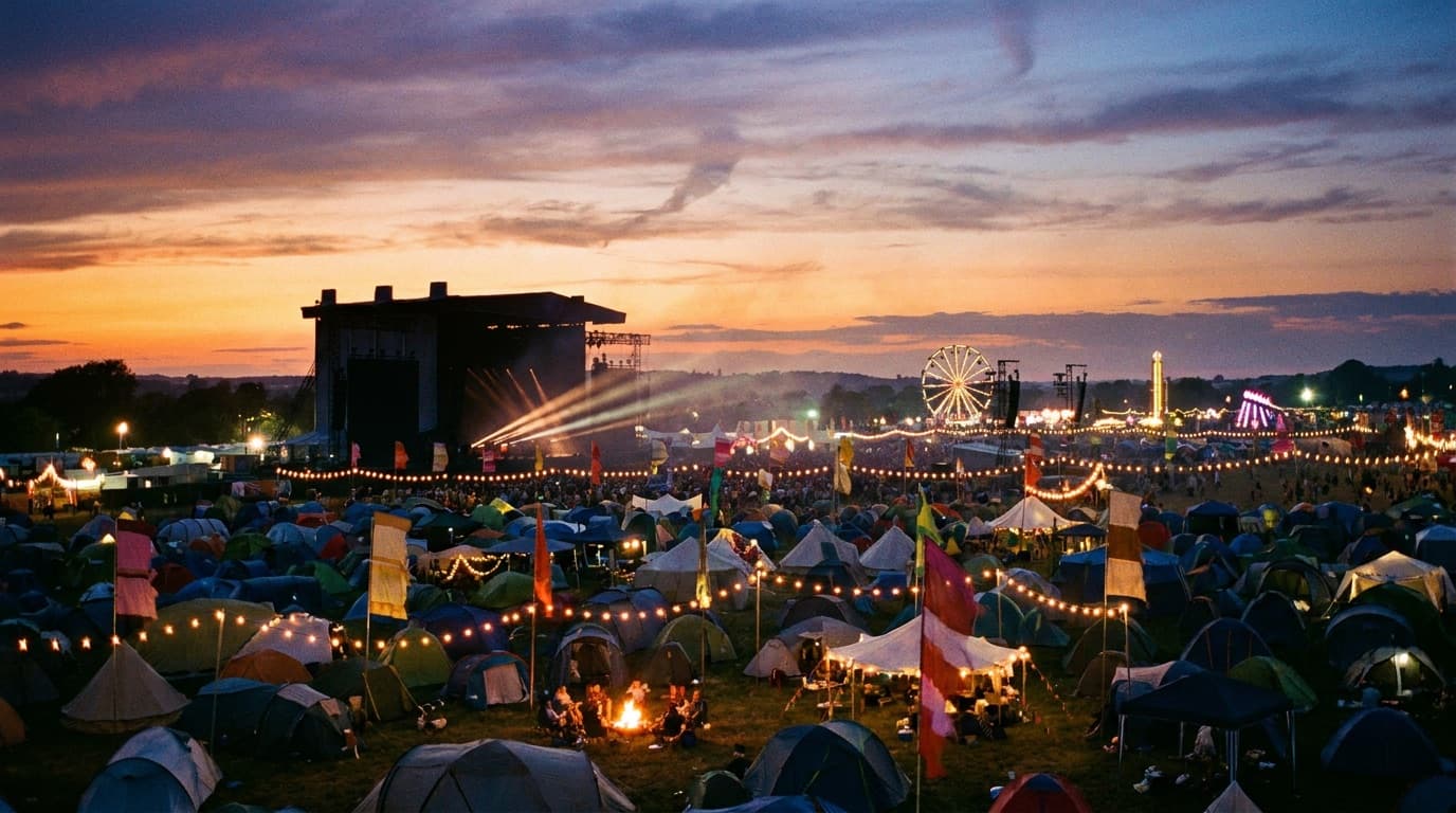
“A club night flyer titled “CLUB NIGHT” in bold neon type: dark background, energetic crowd silhouettes, laser lighting, event details band at the bottom.”
Describe the event — the title, the vibe, the palette — and Made generates a designed flyer: bold display typography, poster-grade art, and a details band. Proofread the title and set fine print in a design tool.
Club night“A club night flyer titled “CLUB NIGHT” in bold neon type: dark background, energetic crowd silhouettes, laser lighting, event details band at the bottom.”
Put the exact title in quotes plus the vibe — “a flyer titled ‘OPEN MIC’, warm cafe scene, vintage paper.”
Short titles render well but not perfectly every run — check each letter and regenerate if one drifts.
Portrait for print and stories; square for feeds. Ask for the shape you need.
Dates, venues, and small text belong in a design tool — exact, editable, and legible.
Real results from Made. Use a prompt to load it into the studio above, then add your own photo.
“A club night flyer titled “CLUB NIGHT” in bold neon type: dark background, energetic crowd silhouettes, laser lighting, event details band at the bottom.”
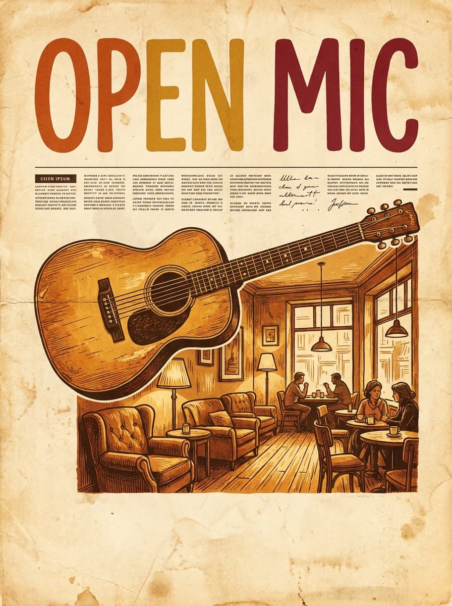
“An open mic night flyer titled “OPEN MIC” in hand-lettered type: warm cafe scene with an acoustic guitar, vintage paper texture, details line at the bottom.”
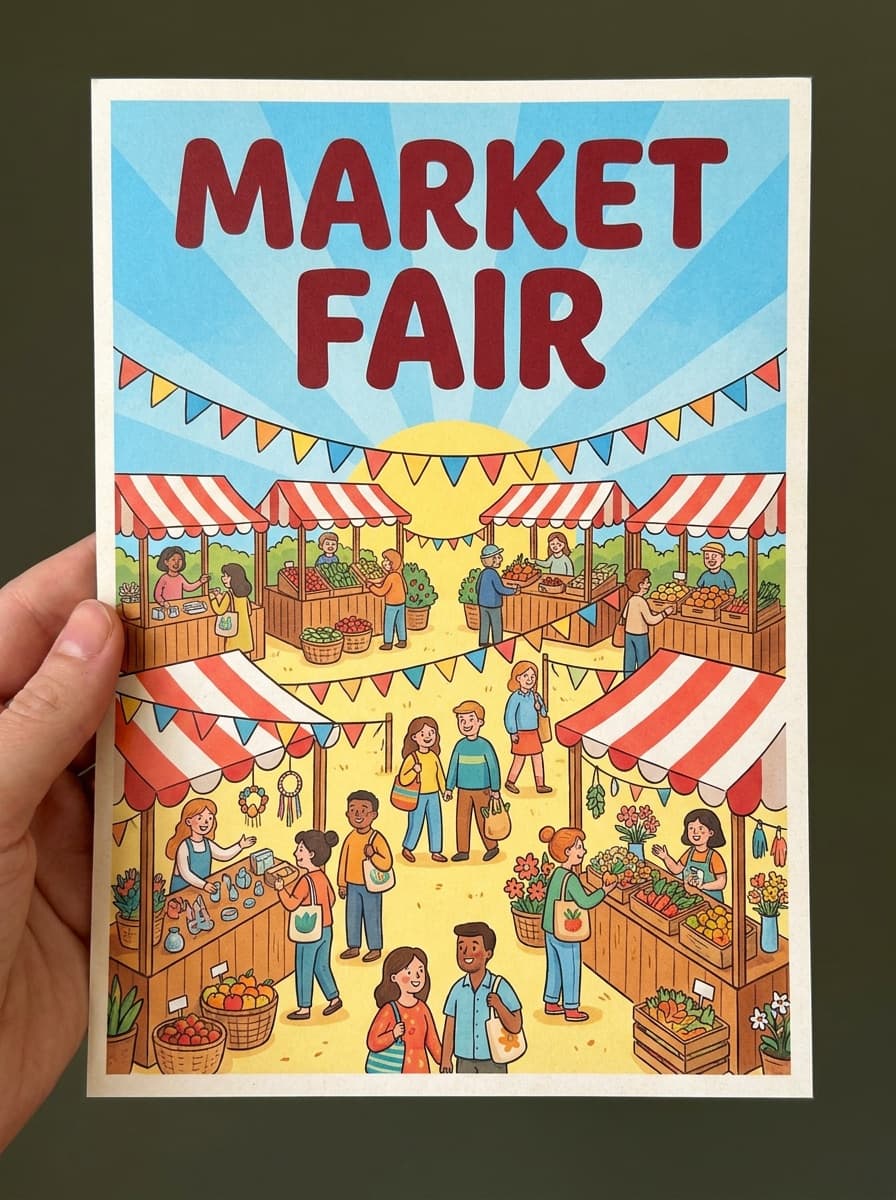
“A weekend market flyer titled “MARKET FAIR”: cheerful illustrated stalls and bunting, bright daylight palette, bold friendly title at the top.”
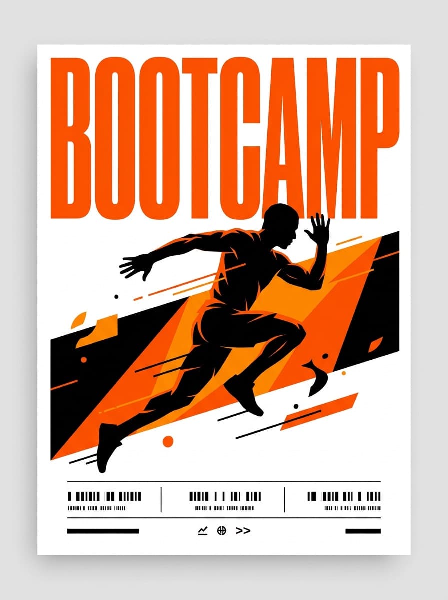
“A fitness bootcamp flyer titled “BOOTCAMP” in bold condensed type: dynamic athlete silhouette mid-workout, energetic color blocking, schedule band at the bottom.”
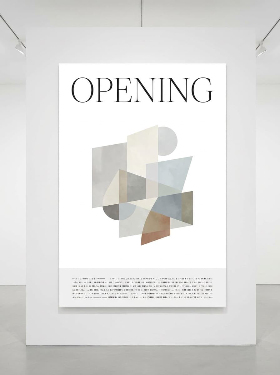
“A minimal gallery opening flyer titled “OPENING” in elegant type: refined abstract composition, generous white space, small details line at the base.”
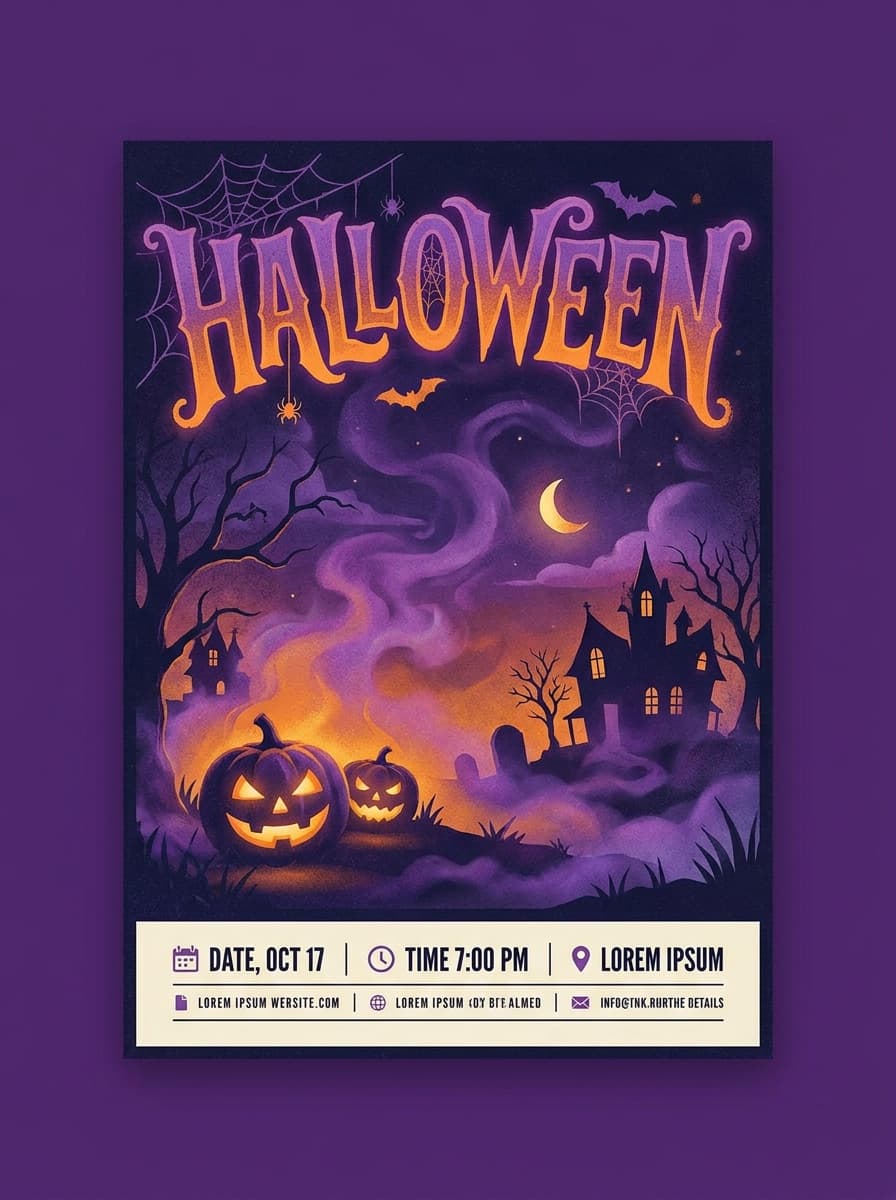
“A Halloween party flyer titled “HALLOWEEN” in playful spooky lettering: moody purple-orange palette, atmospheric fog, festive details at the bottom.”
Checked against the running tool on 2026-09-04.
The title, yes: put the exact wording in quotes and current models render short display type well — proofread every letter and regenerate if one drifts. Dates, times, and venue details are where generated lettering still fails too often; set those as real text in a design tool, where they stay editable when plans change.
Templates are recognized on sight, and event promotion lives on standing out in a feed. Generated art is specific to your event’s vibe — a rooftop jazz night and a warehouse rave get genuinely different images, not the same layout recolored.
Portrait dominates: A4/letter for print and 4:5 or 9:16 for social. Generate in portrait, then hit exact pixel or print dimensions with Image Resizer. For print sharpness, run Image Upscaler before sending to a printer.
Write one style sentence — palette, art style, recurring motif — and reuse it every month, changing only the scene. The series stays recognizable on a wall of posters while each edition feels new.
One strong visual idea, high contrast where the title sits, and energy that matches the event. Describe the audience’s feeling (“sweaty basement show” vs “elegant wine evening”) — mood words steer composition more than object lists.
You can describe a landmark and get a stylized rendition, which usually works for local flavor. For an exact building, better practice is generating the art and compositing a photo of the venue in a design tool.
Yes — promoting ticketed events and businesses is normal use. Keep prompts away from celebrity likenesses and existing artwork; for music events, remember the artists’ names and logos you add afterward have their own usage rules.
See what each one makes, then open it in Made.